Image: Source
When you run a business, there are always going to be a lot of stats or data thrown your way. Sometimes you have to present that data to your employees, customers, or even the marketing firm you use. When presenting this data, you want it to look as professional as possible. You want to take a look at the presentation and understand it right away. There are some techniques you can use to make sure your data is both visually professional and easy to understand.
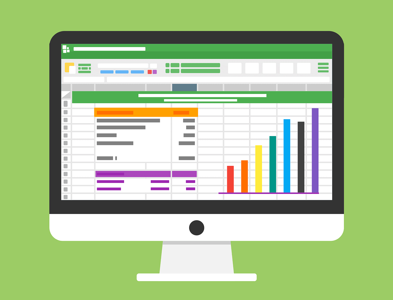
Why is Data Visualization Important?
It’s hard to think of a professional industry that doesn’t benefit from making data more understandable. Every STEM field benefits from understanding data—and so do fields in government, finance, marketing, history, consumer goods, service industries, education, sports, and so on. Since visualization is so big, it’s also one of the most useful professional skills to make sure you are good at. The better you can show your points visually, whether in a dashboard or a slide deck, the better you can leverage that information.
The concept of the citizen data scientist is on the rise. Skill sets are changing to fit a data-driven world. It is increasingly valuable for professionals to be able to use data to make decisions and use visuals to tell stories of when data informs the who, what, when, where, and how. While traditional education typically draws a distinct line between creative storytelling and technical analysis, the modern professional world also values those who can cross between the two: data visualization sits right in the middle of analysis and visual storytelling.
Different Types of Visualizations
When you think of data visualizations, you probably immediately think of bar graphs and pie charts. The thing is though, there are many more big data visualization tools out there that you can use to help your business. While both bar graphs and pie charts are integral parts of visualizing data, it is important that you pair the right data with the right kind of visualization. Simple graphs are only just the beginning and you should educate on other types. Things such as charts, graphs, tables, maps, infographics, and dashboards are some of the most commonly used data visualizations. Area charts, heat maps, bullet graphs, histograms, tree map, timeline, and more are examples of a more specific type of data visualization. It is up to you to take a look at your data, look up data visualizations, and decide which one works best for what you are trying to say with your data.
In the end, data visualization is very important when it comes to business. When you present your data in a good and well thought out way, you not only make yourself look better, you will give the person you are presenting to much more confidence as well. Data is not something a lot of people like to read. So learn to make yours look more interesting and that much more interesting. You will see the difference almost immediately.

The Editorial Team at Healthcare Business Today is made up of experienced healthcare writers and editors, led by managing editor Daniel Casciato, who has over 25 years of experience in healthcare journalism. Since 1998, our team has delivered trusted, high-quality health and wellness content across numerous platforms.
Disclaimer: The content on this site is for general informational purposes only and is not intended as medical, legal, or financial advice. No content published here should be construed as a substitute for professional advice, diagnosis, or treatment. Always consult with a qualified healthcare or legal professional regarding your specific needs.
See our full disclaimer for more details.